


Mobil started with a sign on an old rack railway metal plate, with carved cuts in mechanically engraved letters.
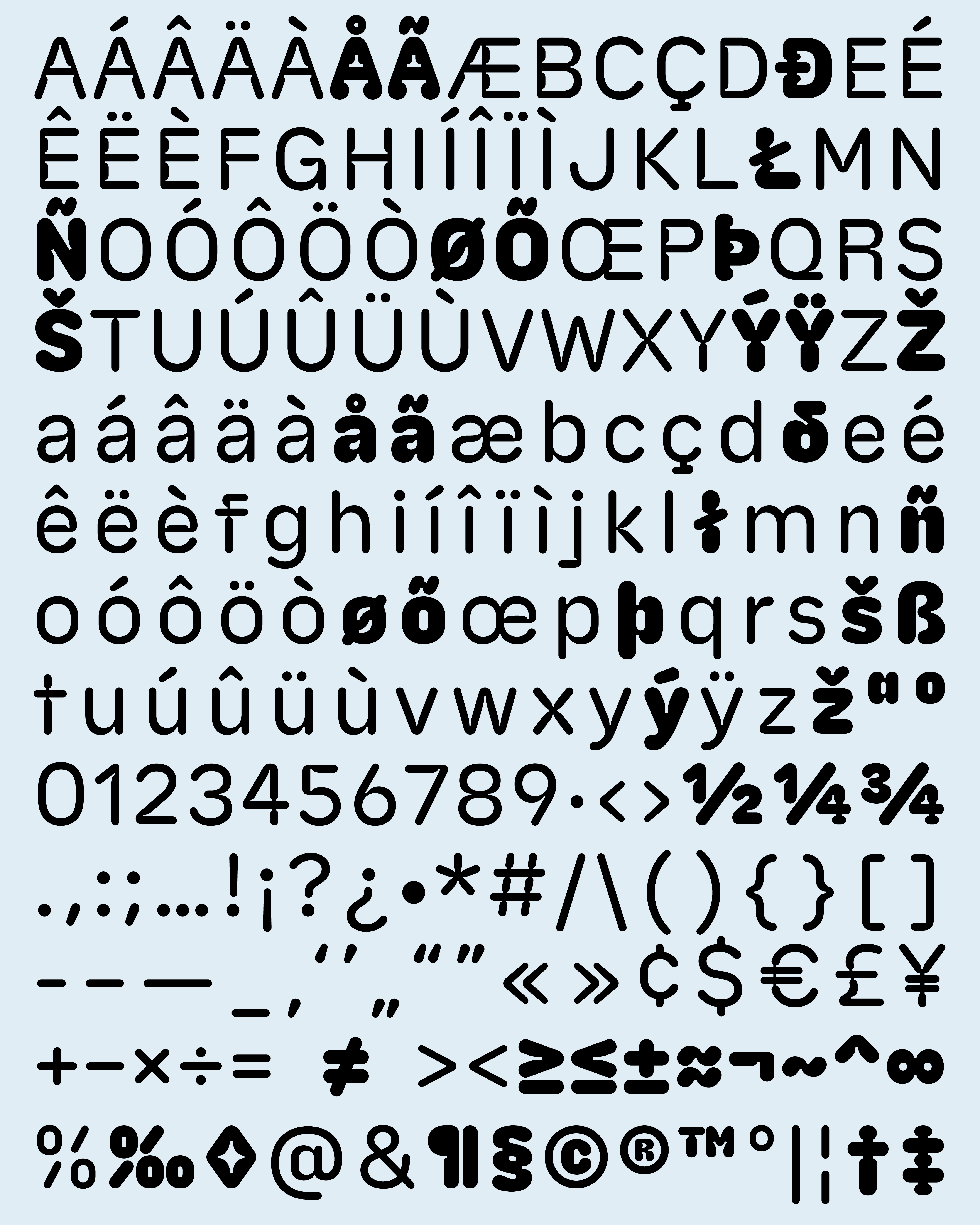
The typeface was designed as a drawing exercise interpreting ink-traps. It is characterised by horizontal and vertical cuts in round puffy letters. The dark weight of the typeface is pushing the limits of the principle in a tense balancing play. The letters can be stacked up tightly for a striking and round presence on page or screen. Mobil is available on ecal-typefaces.
The typeface was designed as a drawing exercise interpreting ink-traps. It is characterised by horizontal and vertical cuts in round puffy letters. The dark weight of the typeface is pushing the limits of the principle in a tense balancing play. The letters can be stacked up tightly for a striking and round presence on page or screen. Mobil is available on ecal-typefaces.