

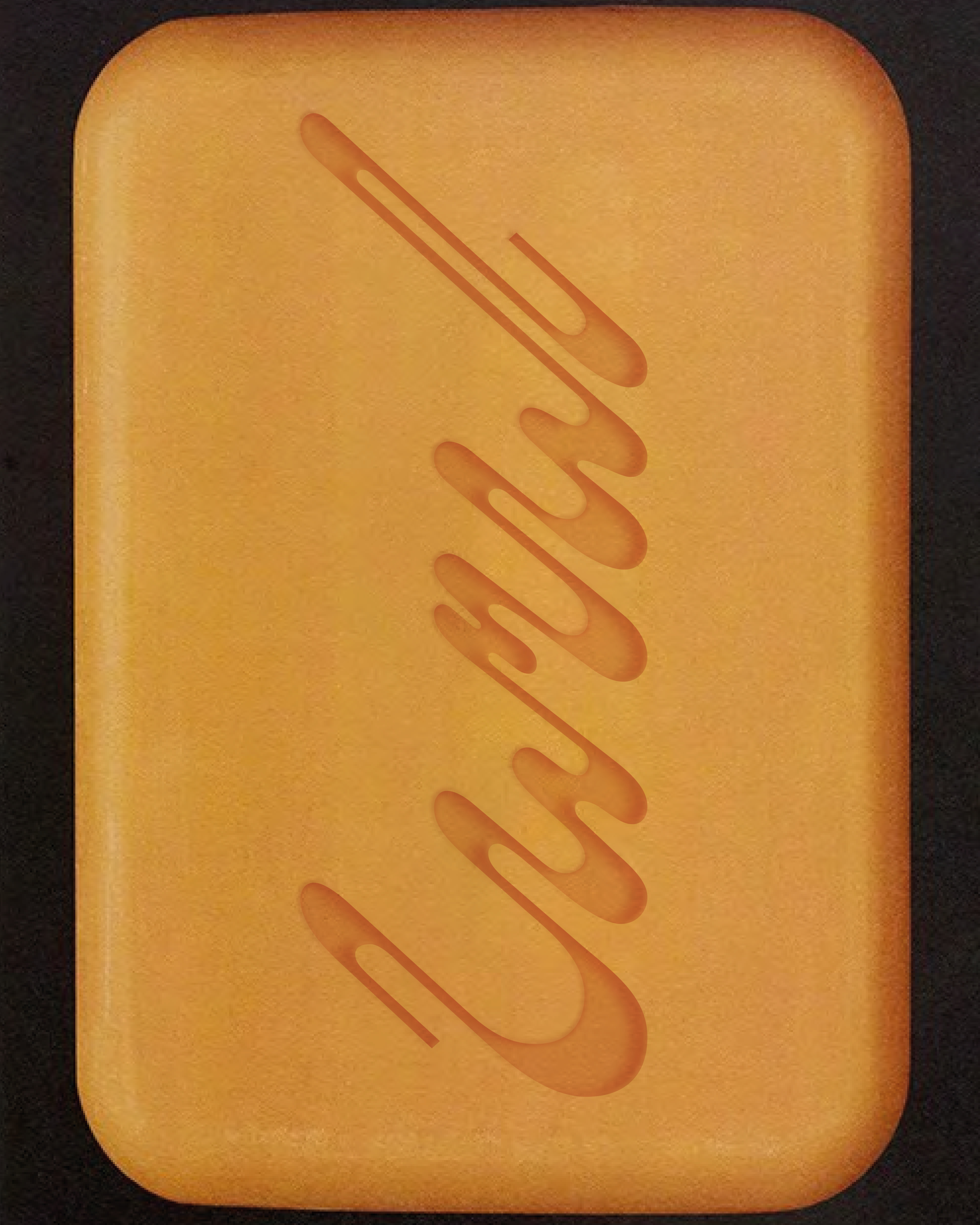

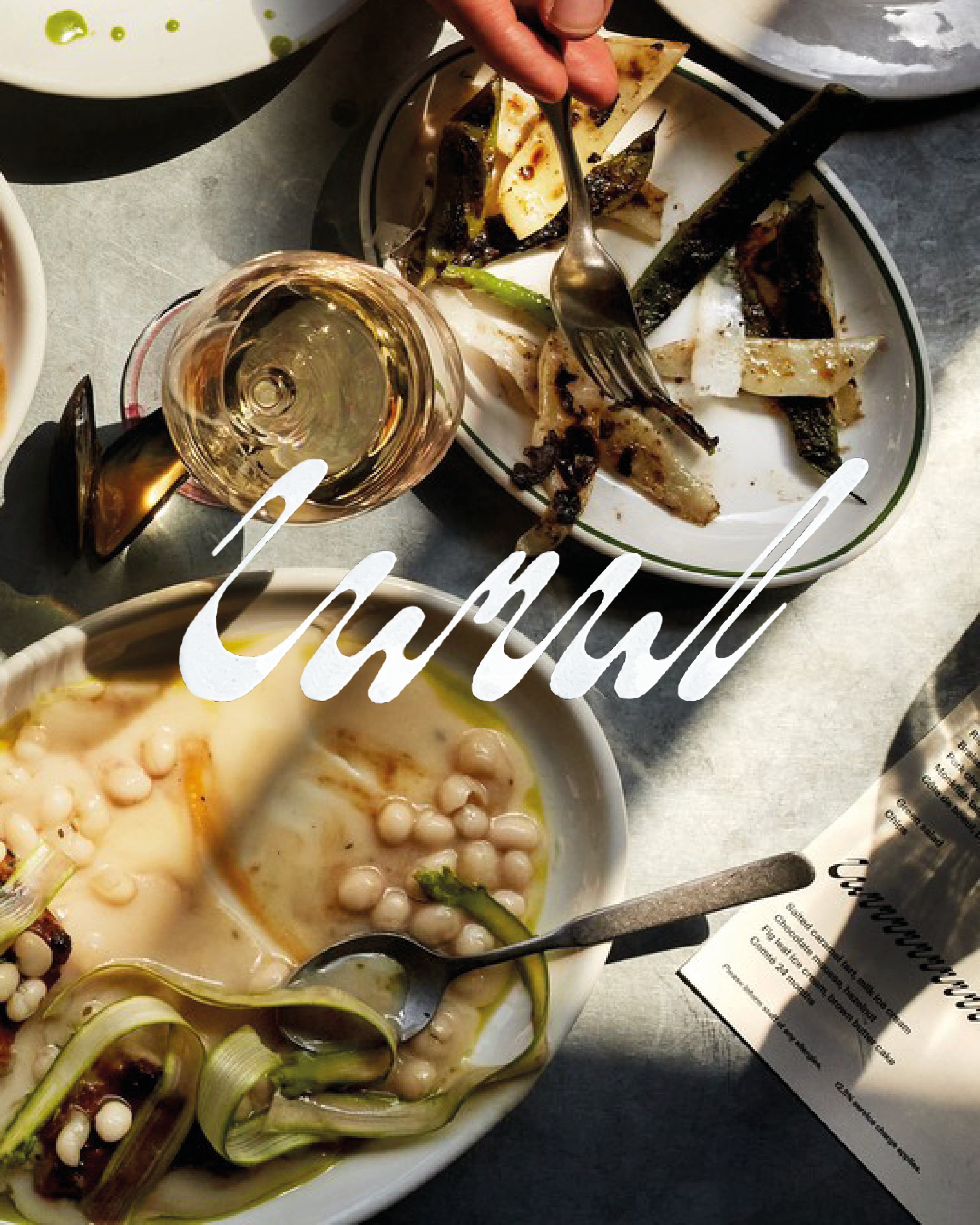

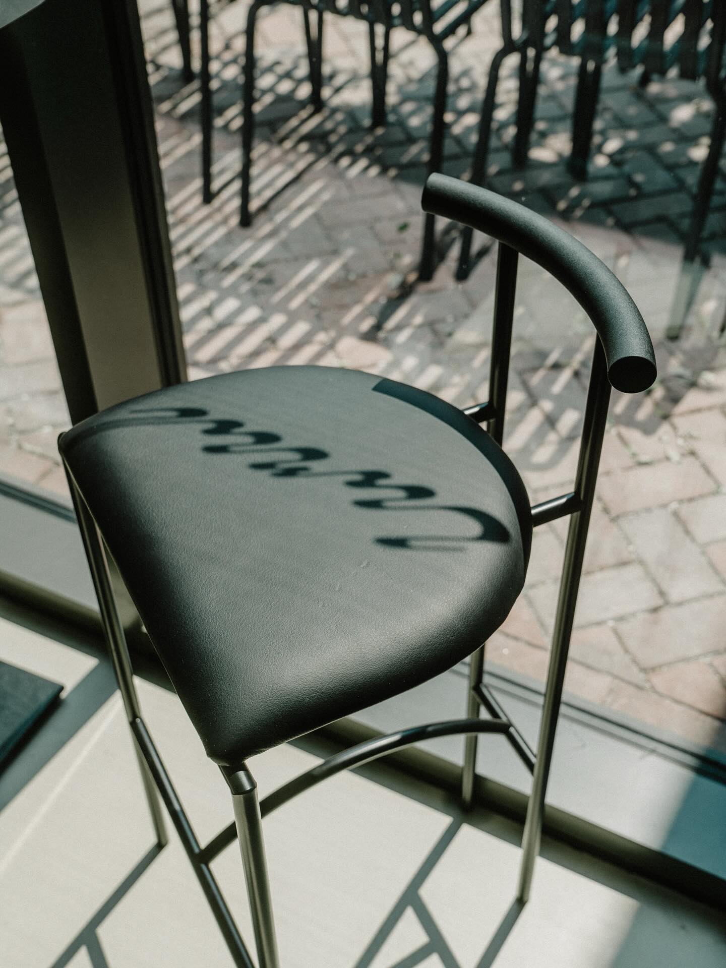
Visual identity for London restaurant Canal done for Mestiza Estudio.
The drawing of this logotype takes inspiration in the water element, as well as the city’s waterway maps. The word canal is written in a continuous line using a bevelled nib. The stroke mimics waves. The flowing and floating wordmark is at the intersection between drawing and word. The logotype explores the symmetrical nature of the word canal, pushing the similarity between the curves of ‘C’ and ‘l’.